Uniformity: Dressing for Success
2015-03-06The Cavs are looking sharper in the alt blue unis…but are they lucky?
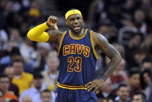
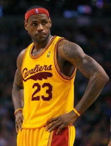
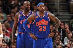
Though seemingly mothballed after the home loss to the New York Knicks for what could only have been karmic reasons, we’ve seen a recent resurgence of the Cavs alternate blue uniforms. Since their unfortunate debut, the Cavs have evened up their record in the alt unis to 2-2. It remains to be seen if this positive trend continues, but for now it appears that the blue will factor more heavily in the mix.
However, this seems like all the uniform experimentation we can expect as Cavs fans this season (not including the forgettable special “first name” X-Mas jerseys). We’re seeing a plethora of new designs and color schemes being used around the NBA this year, and it’s curious that the Cavs aren’t at the forefront of that… especially given the connections two certain all-stars have with a certain major shoe and athletic apparel company.
So, how did we get here?
The re-design blues…
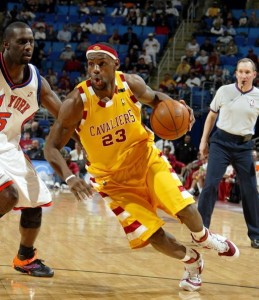
When there were rumblings late last summer that the Cavs might be going to introduce some new alternative uniforms for the upcoming season, you could color me excited… I’d personally had just about enough of the “mustard and ketchup” jerseys of the last few years with their simple designs and lack of pizazz (as well as their connection to the dark ages of no LeBron).
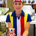 Then Dan Gilbert tweeted out a preview in early October showing the new blue alternative version of the current uni… and I remember my mood at the time matched the color. Here I was expecting some sort of dramatic re-design… and what we got was more reminiscent of a uni from say… Hot Dog on a Stick. Don’t get me wrong, I think the blue unis are a welcome improvement over the standard colors…
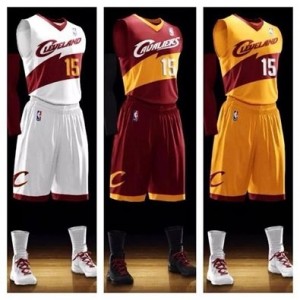
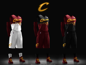
But with images like these floating around the internet…
…it seemed like the uniform redesign would be much more radical to match the splashiness of the newly constructed team, the upgrades to the humongotron and the 3-D floor projection that DG added to the Q.
Honoring the past…
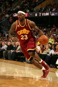
While the home white, road wine and alt blue unis of the first LeBron Era of 2003-10 were a welcome re-design to the awful and simple block black and blue unis of the previous couple of years, I had a genuine affinity for most all of the alternative throwback uniform styles the Cavs mixed in, starting in the 2008-09 season. Having been a Cavs fan since the “Miracle of Richfield” days, it was wonderfully nostalgic to see things like…
…the old feathered logo from the team’s inception…
…the checkerboard trim from the Miracle days…
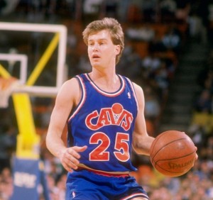
…and the blue and orange “Cavs” basketball logo from the great teams of the late 80s and early 90s.
The CavsFanatic uniform mashups…
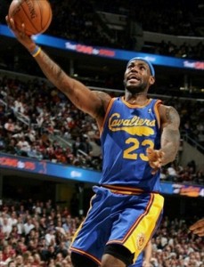
Then the Cavs got truly creative and started putting their own unique spin on the throwback unis. These were classic designs that featured a mashup of other colors from different eras, and resulted in two of my favorite Cavs uniforms ever…
Keeping up with the trends…
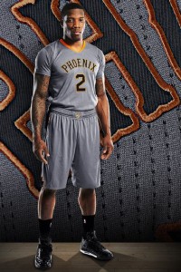
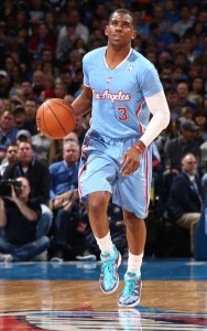
More and more, we’re seeing sleeved jerseys incorporated into alternate team uniforms throughout the league. Some of them are really eye-catching and aesthetically pleasing (or at least interesting)… like the Suns’ “Phoenix Rising” unis or the Clippers’ “Back in Blue” get-up…
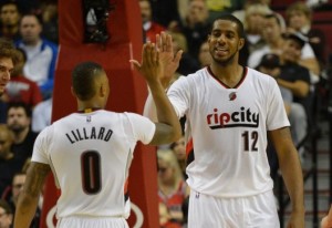
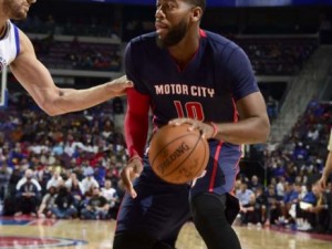
…others call attention to, or honor the history of the team’s city like the Blazers’ “Rip City” unis or the Pistons’ “Motor City” duds…
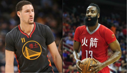
…or even celebrate heritage and culture like the Warriors’ and Rockets’ special “Chinese New Year” celebration jerseys that were unveiled this season…
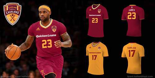
Since LeBron has been on record that he’s not a big fan of the sleeved jerseys, the odds are against the Cavs adding that feature in the next uniform re-design. However, if they did… it might look something like this…
The look of the future…
If it were up to me (and it isn’t) to suggest design themes for an alternate Cavs uniform, I’d probably try and tap into the history of the city.
 Maybe a “Rock & Roll” themed uni that honors the HOF and the birthplace of rock and roll. They could even incorporate the logo…
Or an homage to the place they call The Land…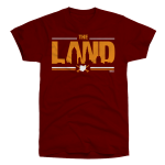
Or some version of the city skyline as depicted in the uniform designs above that were kicking around on-line.
Or even another logo (if the Cavs can get permission from Warner Bros. and DC Comics) to honor native Clevelander Jerry Siegel and his greatest creation… Superman. The Cavs already have the right color scheme if they decide to go that direction…
Since the Cavs should continue to win a lot of games in the foreseeable future, they might as well find new ways to look good while doing it.
But I’m sure I’m not alone in wanting to see what the Cavs will come up with for their next uniform design. Everyone has their own tastes, and I’m sure a lot of you probably disagree with my favorites… So chime in and let your inner uniform critic/designer out to play…

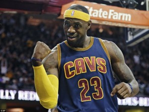

Maybe the team that wins the championship the previous year gets to wear capes the following year.
If we keep winning I think they should be allowed to have uniforms with capes.
LOL! Now that would really be a fashion statement!
YOU THE MAN —EVIL ONE !!!!!
I AM STILL WAITING ON THE ” CTB ” SHIRT EVIL IS ERNESTLY WORKING ON –RIGHT EVIL —-THERE IS A CASE OF MOSCOW MULE AND CHRISTMAS ALE ( OOPS THAT IS GONE ) WAITING YOU ON COMPLETION OF THE SHIRTS —PUT ME DOWN FOR A DOZEN ALREADY—-ENJOYED THE COMMENT ON KEMP/ BET HE GETS NERVOUS ON FATHER’S DAY—GO CAVS —NEED TO SEND A MESSAGE TO THE HAWKS TONIGHT !!!
Stay tuned on the t-shirts…
Kemp gets more cards on Father’s Day than Santa gets the month of December.
How do you post an image in the comment box?
Apparently it’s a trade secret. I’d be interested too if anyone is willing to spill the beans.
I’m not sure… I’ve only been able to do it in my posted articles…
Have to be an editor.
I agree with Cols regarding the Hawks. Kyrie is going to carve them up like a turkey.
All I care about is the high socks. Whatever happened to them? To this day I don’t understand it. Hence, there’ll never be another Footsie Walker.
All I care about are short-shorts. Whatever happened to THEM. Amiright?
Are you making fun of me? : )
Ok. I guess they had to have long socks to keep them from being too cold with the short shorts.
Some guys still wear the high socks (doesn’t Shawn Livingston?), but nobody wore them better than Larry Nance…
This was a concept uniform I thought was clean and interesting.
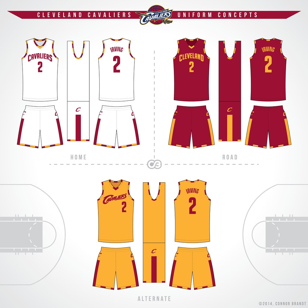
I hate the “Cavaliers” logo on the alternates there. Just hate that style of lettering.
I think we might just blow the Hawks out tonight and expose them as the frauds they are. Their roster is not good.
Kyle Korver just read this and lost all confidence.
I agree. Anytime a team has the best record in the sport with 75% of the season gone, they’re clearly frauds. Hyperbole much, Cols? blowing out the Hawks is a realistic possibility, as is getting blown out. In fact, both teams have handed the other their worst losses of the season. I think we’re the better team in a seven game series. But on any given night, they can get hot from deep and have just enough skill inside to force you to stay honest. Their team defense is excellent, and if they frustrate the Cavs early hero-ball may rear… Read more »
We have LBJ and Kyrie, they have what? Someone who might be as good as Kevin Love, maybe? You can gameplan against teams like ATL and that’s exactly what we will do in the playoffs.
You cannot gameplan against greatness though. LBJ and Kyrie can get their shots against anyone. It’s impossible to stop.
This comment is hilarious given what happened. The Hawks DID game plan for LeBron and Kyrie. It worked masterfully, giving them both fits. In the meantime, the Cavs Mozgov-anchored defense was poorly equipped to handle the Hawks ball movement.
We all can agree the electric blue uniforms from the 90s were the worst ever, right?

my eyes!!!!!!!!!!!!!!!!!!!!!!!!!!!!!!!!! ugh
so ugly
Ha! Yeah, I couldn’t bring myself to include pics of those… just so hard on the eyes!
Women got pregnant just from looking at Shawn Kemp in that jersey.
I must say, those Fratello coached teams were underrated. I loved watching them compete hard every night. Brandon, Tyrone Hill, B Phills (RIP), Chris Mills, Sura…
But painful to watch… the “slow probe” offense.
HAHAHAHAAHAHA! love it, Nate
I’ve seen a lot of people recently wearing these around. The retro-90’s NBA gear is in vogue right now and it’s given me a new appreciation for these jerseys — they’re so bad that it’s kinda cool (but still bad).
Def worst Cavs uniforms ever
The current blue alternates are possibly my favorite Cavs jerseys yet. I think the trim and primary colors look great together — very simplistic, clean-cut, modern. Simultaneously playful and professional (kinda like Bron!). Honestly I think the current uni’s in general are maybe the best looking the team has ever had. Not too much flash but still swagged out with the bright colors; not trying to get too fancy with the design. The mustard yellow def works for me. Overall I like garish color schemes being used in a stylized, tactful manner (I sometimes dress this way when going out… Read more »
Love this article. I agree with most of your points about the unis.
My favorite Cavs unis:
– the wine and gold mashup
– the old feathered from the team’s inception (gold and wine)
– the blue and gold feathered mashup
And I’m so glad they’ve gotten away from the new Cavs logo from the LeBron days. The modern sword and basketball thing was god awful. It was like an arena football logo. No thanks.
Also, I’d love to see a white uniform with wine numbers/letters/logo. Maybe with one of the logos from the mashup jerseys.
I think if done right, it could look really cool.
Yep, It’d be better tan the current blue ones no doubt
I also think a simplistic use of the following:
Could be cool. If it was just the swords and no lettering, kind of like the Golden State unis that just have the bridge in the circle. I think it could be the Cavs sleeved jersey.
Maybe a white/wine version. I wish I still had Photoshop so I could give it a go.
I like this logo also… good call Gordon!
The NBA did a really nice job with the Chinese New Year shirts. The Golden State one looked really fantastic. Thank God, Houston stayed away from their McDonald’s colors.
Totally agree… seeing those made me really wish the Cavs had done something more interesting or forward-thinking for their alt unis this year… I’m not a GSW fan, but I’m tempted to buy one of the Chinese New Year gamers just to have one…
I did not like the proposed new Unis, and I’m glad they didn’t go with them. Skyline Unis are rarely good (save Denver’s classic rainbow jerseys — so bad they’re good– and the Sonics’ Space Needle). I have to say the mashup unis are my favorites. I think next week we should do a t-shirt article. I picked up a pretty sweet richfield coliseum t-shirt a couple weeks ago. Speaking of the coliseum, anyone ever catch this article?
http://www.clevescene.com/cleveland/remnants-of-richfield-the-untold-story-of-how-the-cavs-floor-from-the-richfield-coliseum-ended-up-at-a-small-school-in-virginia/Content?oid=4401650
Yeah the mashups are pretty good. I still don’t thinkt he blue works there though. But I could come around on it.
This is an awesome article, Nate! I may have to take a trip to Staunton sometime to see that… Just some amazing memories connected to that floor…
I loved and still love the Price era ball in the “V” blue uniform. I’m also with you that the mashups of old with new we’re really great. The new blues are alright, but not great.
The feathered unis are my personal favorite. Classic. Price era are second. I’m actually a fan of the wine and gold. One of the better color combinations, just doesn’t look right on the current design. Blue and gold works too. Wine and blue looks like an old woman’s blouse.
Old woman’s blouse? Sign Mike Miller up!
Who am I supposed to be scared of tonight? Atlanta’s roster is full of almost stars. I bet they really let down in the playoffs against teams with superiour talent.
Cavs have gotten a lot better at defending the perimeter (the Raptor’s hot shooting notwithstanding) so it seems like the Hawks will try to beat them up inside with Horford and Millsap early to free up Korver and their three-point shooters as the game progresses. Hopefully, Moz and TT (and maybe Perk) can shore up the paint to make things tough on the Hawks…
You’re not supposed to be scared of any individual. The hawks are trying to be a ream team with no stars. I know that you think basketball is played one on one, but there are actually five guys from each team on the floor at one time. The Hawks are good. I don’t know if they can with with their style in a seven game series, but they can beat anybody on any given night. If we are lucky enough to meet them in the ECF, it will be a tough series.
Considering no team has ever won without stars, I think my viewpoint is totally fine and reasonable. No team in the NBA wins without stars, except maybe the early aught Pistons, but even they had Billups, Rip, and Wallace.
Players don’t become stars till they win. No one gave a crap a bout those guys on Detroit till they won. I still say that Detroit team might be the greatest coaching job in NBA history.
Yeah, they really are the only outlier in NBA history to win without truly great players. It was impressive. But this Cavs team would kill them.
In NBA history?
The Wilkens-era Sonics made two finals in a row and won a title, with Jack Sikma, Dennis Johnson, Gus Williams, former Cavalier John Johnson…
The ’75 Warriors won the title with Rick Barry and a bunch of decent players that let them go about 10 deep. (The Miracle Cavs followed a similar template, except for the Rick Barry part, and coulda won the title if Chones hadn’t got hurt.)
The ’77 Blazers had Walton + role players and great coaching by Dr. Jack.
More than one way to skin a cat…or lift a trophy.
Very impressive, Phil Hubbard!!!
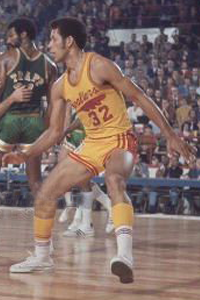
And speaking of John Johnson, I believe that’s him in the photo above of the vintage No. 32 gold jersey with feathered logo.
Ok. Let me make a note to myself: Don’t get into an historical debate with Phil Hubbard at any time.
BTW: You’re not the real Phil Hubbard. Are you?
No, I’m not Phil, but I always liked him. I guess as a Cleveland fan, I have a thing for what-might-have-been stories. He was a star in the making until he injured his knee in college. Wasn’t nearly the same player after that, but remade his game and had a 10-year career in the NBA.
I hate the new blue unis. They are ugly and suck. Buy I liked the old blue/orange and I love the wine and gold. That was a great decision to go with wine and gold as new colors.
Yeah, but as I noted, the design just seems boring and played out. Keep the color scheme, but mix up the look IMHO…
False. Blue Unis are attractive and the opposite of suck. We should combine the Navy with the skyline uni’s from the internet. Or maybe the Superman logo with a “C” with the feathered tail? I really like the Navy Blue.